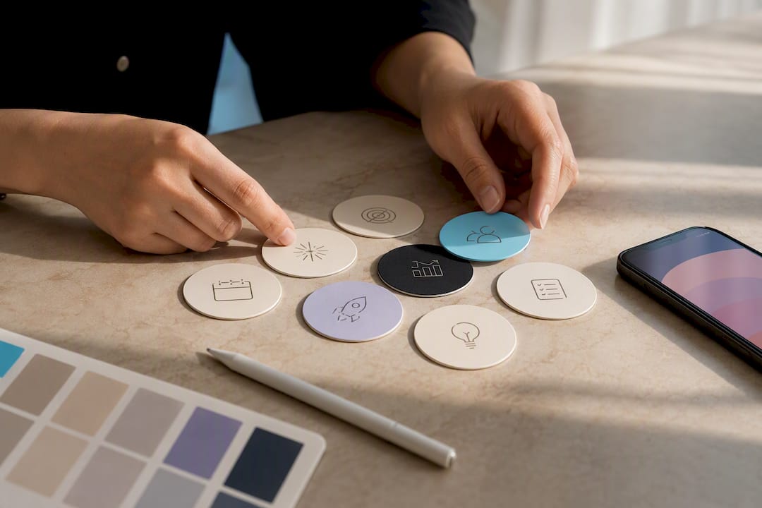
Story Highlights turn your 24-hour Stories into a permanent discovery path that lives on your profile forever. The single most important move you can make right now: open Instagram settings, enable Save story to archive, then create your first Highlight labeled “Start here.” That one action gives every new visitor an instant answer to “who is this and why should I care?”
TL;DR:
- Enabling the save story to archive is essential, as it allows you to reuse Stories for Highlights, which are key for profile engagement.
- Creating effective Highlight covers requires high contrast, scaled-up icons, and consistent design, best produced in batch using templates in Canva or Adobe Express.
- Your first three Highlights should clearly introduce who you are, showcase proof of your work, and include a direct call to action to maximize visitor retention.
- Regularly updating Highlights monthly and removing outdated content quarterly prevents your profile from displaying stale offers or broken links.
- A simplified three to five Highlight structure with clear labels and a consistent visual style can significantly improve engagement and DM or booking conversions.
You have two ways to build a Highlight, and both start with the same requirement: your Story Archive has to be turned on. Without it, Instagram won’t let you pull expired Stories into a Highlight at all, only your current active Story.
From an active Story:
From your Story Archive:
If Stories seem to be missing from your archive, check that your account didn’t have archiving disabled when you posted them. Business and creator accounts sometimes default differently than personal accounts, so it’s worth confirming your account type in settings if content from months ago simply isn’t there.
A cover has to communicate its topic in under a second, because that’s roughly how long a scrolling visitor gives it. High contrast between the icon and background matters more than clever design. So does keeping any icon or text scaled up and centered. Thin fonts and busy backgrounds disappear at the tiny size Highlights actually display.
You’ve got four realistic style directions to pick from:
Export covers as square JPG or PNG files, since Instagram crops them into a circle automatically. To upload a custom cover, open the Highlight, tap Edit, tap Edit Cover, then choose a photo from your library instead of a Story frame. Instagram doesn’t ship its own icon library, so you’ll need an outside source. Canva offers ready-made Highlight cover templates you can recolor in minutes, Adobe Express has a similar library, and Icons8 is a solid pull for standalone icon graphics.
Pro Tip: Build all your covers in one Canva project using a shared color palette. Design consistency across covers makes new visitors read your profile as more professional and put-together almost instantly, even before they open a single Highlight.
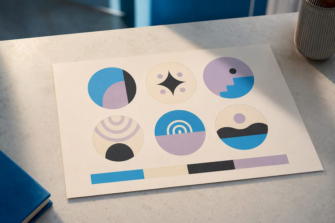
Think of your Highlight row as a tiny landing page. Visitors scan left to right, and the first three carry disproportionate weight in whether they keep exploring or bounce. Therefore, your first row needs to answer, in order: who are you, does this work, and how do I act on it.
A core trio covers most creators’ needs:
Keep labels to one or two words, ideally under 15 characters so nothing gets cut off. Skip vague titles like “Fun stuff” in favor of value-driven ones like “Behind scenes” or “New drops.” Most creators do best with 4 to 8 visible Highlights, enough to feel organized without asking visitors to work for information.
Highlights go stale faster than most creators expect. A monthly glance and a quarterly deep clean keep your profile from showing outdated offers, dead links, or last year’s promotions to first-time visitors.
For metrics, watch profile visits, taps on individual Highlights, link clicks, and any DM keywords tied to a specific CTA. A Facebook-backed survey found 62% of people grew more interested in a brand after seeing it in Stories, which is exactly the effect a well-organized Highlight row is designed to extend permanently. Track performance with UTM parameters on link stickers, a dedicated DM keyword per campaign, and a recurring calendar reminder to audit everything quarterly.
You don’t need design software or hours of free time to get a clean, consistent set of covers.
Icons8 works well for filling gaps when a template doesn’t include the icon you need. Batch-exporting up front saves you from repeating the whole process every time you add a category.
Highlights work best when they’re built like a sales funnel instead of a photo album. A “Start here” Highlight that opens with a clear title card, followed by proof, followed by a single CTA, mirrors how product pages guide a buyer from curiosity to action.
Treat each Highlight like a landing page: answer who you are, then prove it works, then give one clear way to act. Skipping straight to proof or promotion without the “who are you” frame is the single most common reason a profile with strong content still converts poorly.
Copy-ready CTA ideas worth testing: a DM keyword like “START” tied to your first Highlight, a link sticker pointing straight to a booking calendar or shop, or a pinned “Start here” frame that states your offer in one sentence. If you hand this off to a manager or agency, give them your existing covers, your CTA links, and your refresh schedule so nothing gets rebuilt from scratch.

Most creators overcomplicate this. Pick three to five core Highlights, design covers in one sitting using a single palette, then add a CTA and a tracking link to each one. That’s the whole launch plan.
The mistakes I see most often: vague labels nobody understands, eight Highlights that all say some version of “life,” and covers nobody has touched in over a year. DIY works fine if you’ve got an afternoon and a Canva account. Once your Highlights are driving real DM volume or booking traffic, that’s usually the point where handing off cover production and CTA tracking to someone else starts paying for itself.
— Gjon
Designing covers, writing CTAs, and auditing your Highlight row every quarter takes real time, time that’s better spent shooting content or engaging fans directly. A managed service can handle cover production, build your CTA ladder, and run the refresh cadence so your profile never looks stale.
This isn’t just about pretty covers. Our team ties Highlight CTAs into your broader Instagram strategy and connects DM keywords to actual subscription retention tracking, so you can see which Highlight is actually pulling fans toward a sale instead of guessing. If you’re earning $3,000 or more a month and your time is better spent creating than editing cover templates, reach out to Only-dreams to see what a managed setup could look like for your profile.
Canva’s cover template library is the fastest starting point for design. For funnel-style Highlight structure, read Only-dreams’s Instagram strategy guide next.